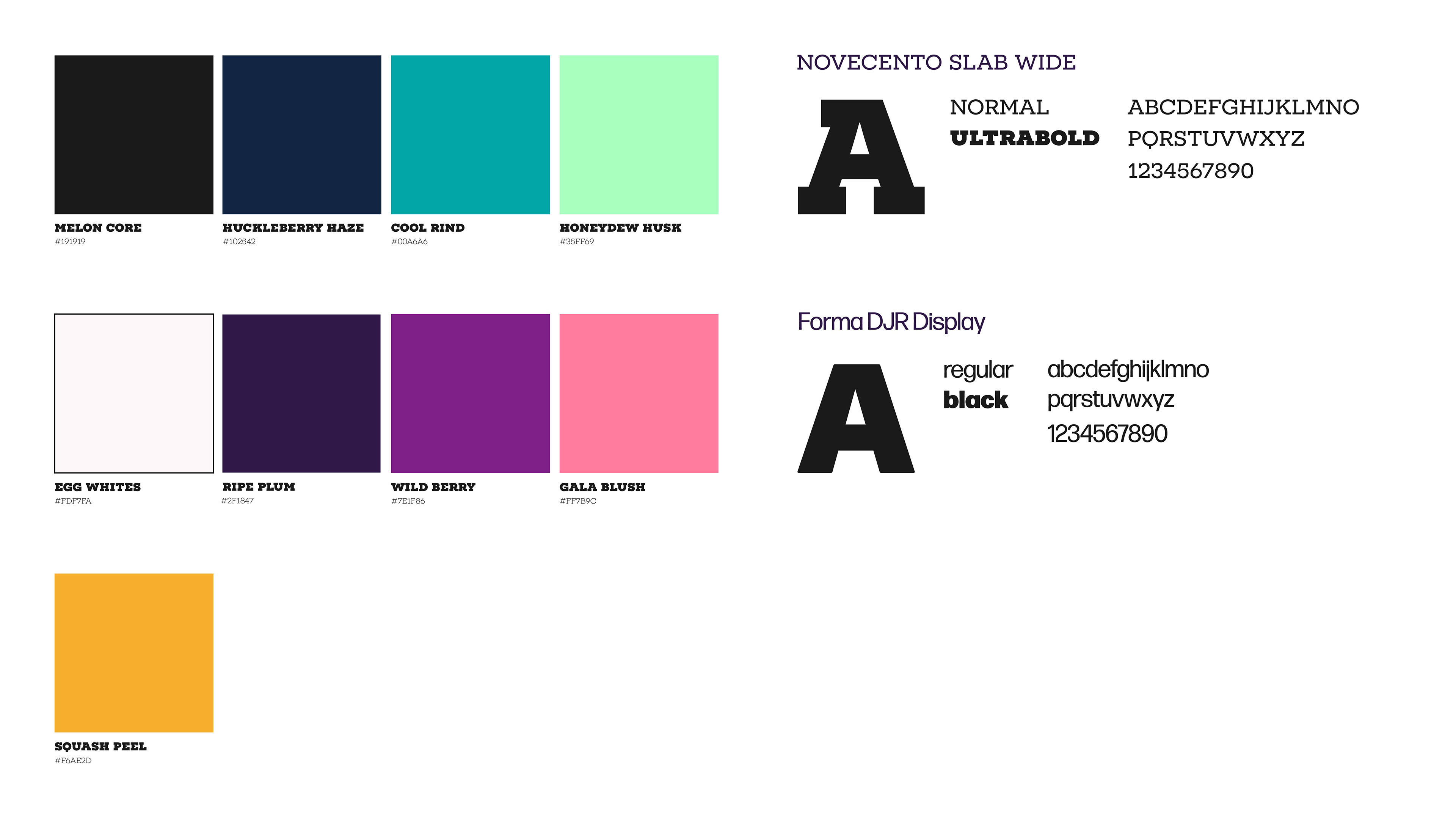
Color: This color palette was intentionally chosen to be versatile, allowing it to represent fruits, vegetables, and various objects. I aimed for a refreshing, welcoming, and healthy feel—qualities that align with the fresh market’s mission. Since the market provides free fresh produce, the colors help convey both the mood and the products offered to guests.
Typography: Like my color choices, the typography reflects the organization’s mood and values. The serif typeface conveys a friendly, welcoming tone and a 'homegrown' feel, reinforcing the fresh produce aspect. The sans-serif typeface adds a sense of professionalism, strength, and trustworthiness. Together, the combination of both typefaces helps communicate the organization’s warmth, reliability, and mission.
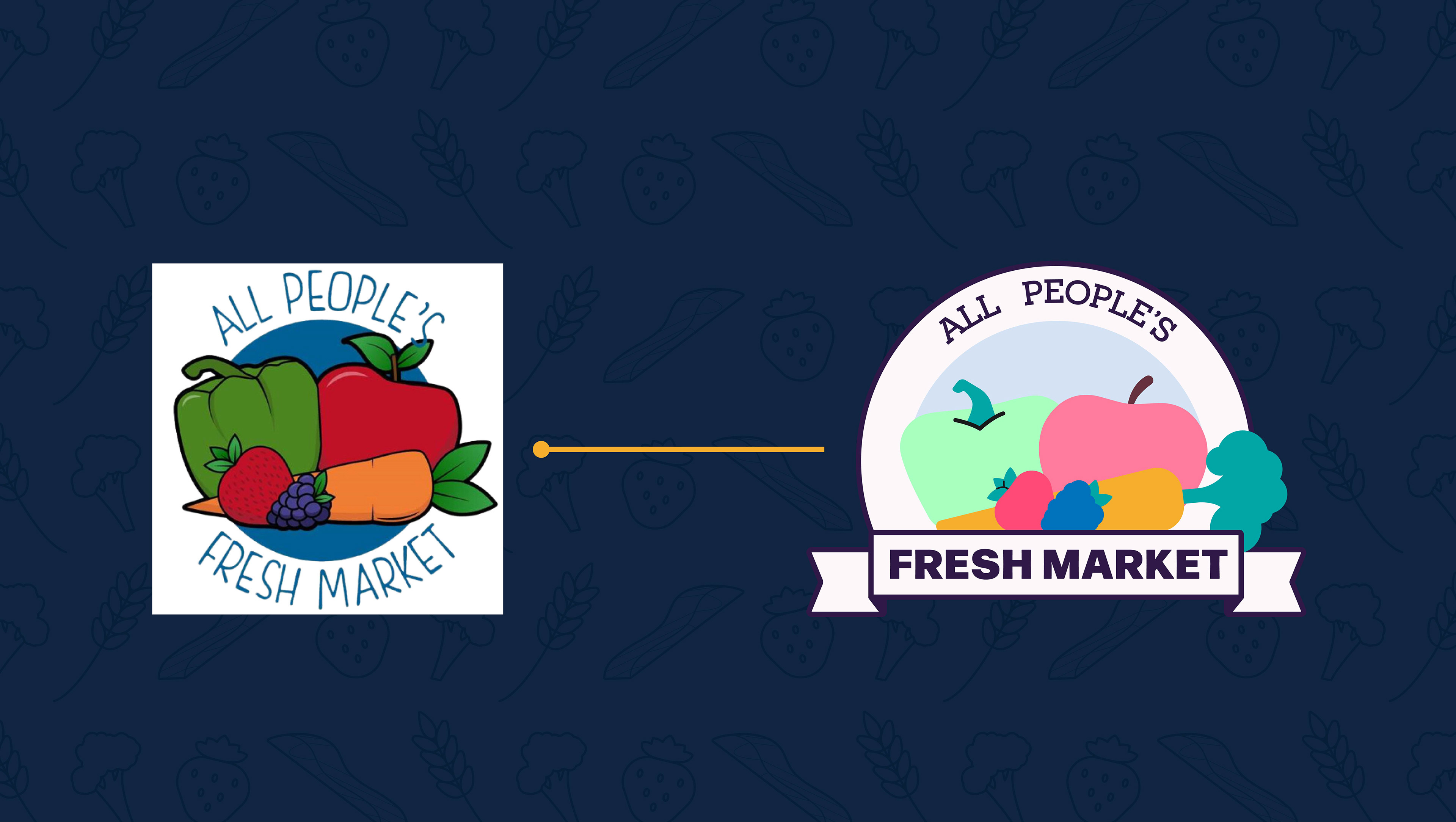
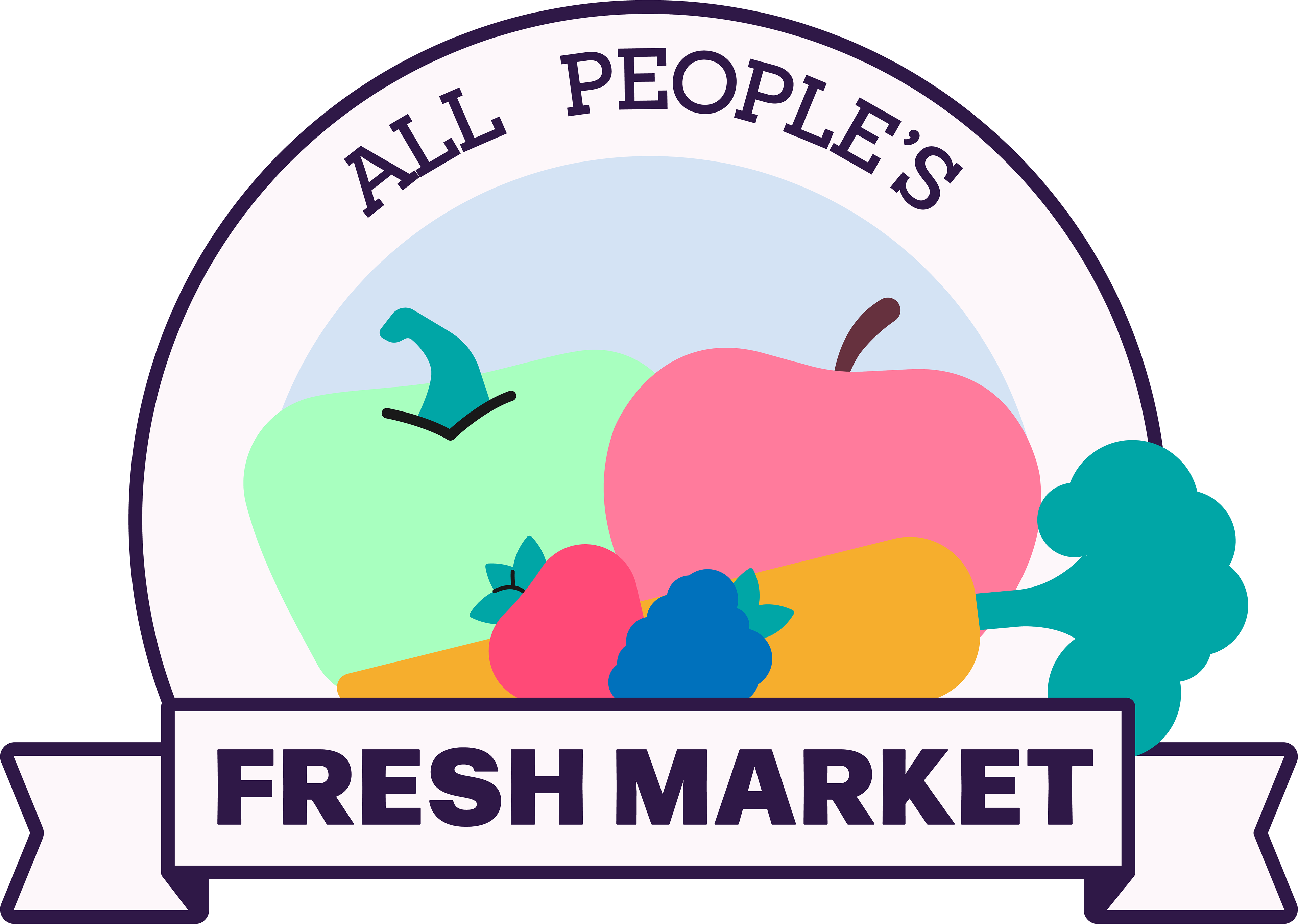
Since the organization lacked a defined design language and I had creative freedom over the project’s style, I felt it was necessary to modify their existing logo. To better align with the video’s aesthetic, I simplified and refined the logo, making it cleaner, more approachable, and professional—while still preserving the spirit of the original design.